Personalized Medicare Shopping Tools
eHealth Medicare | 2020
Responsive website
Background
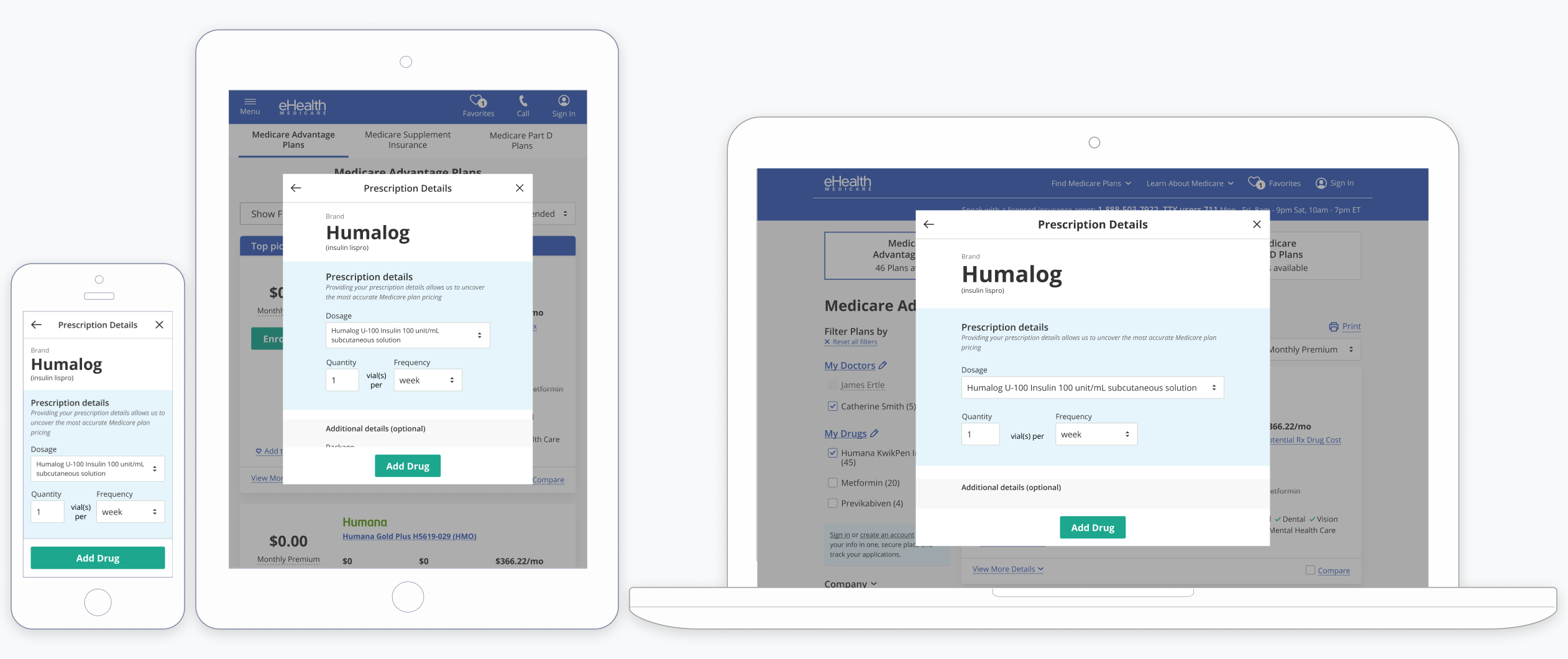
In 2019, I proposed and conceptualized a tools system centering around a user’s daily interactions with their health. This project pitch aligned with corporate objectives and in 2020, we launched the optimized Drug, Doctor, and Pharmacy Tools for eHealth Medicare to help customers personalize their search for a Medicare plan.
Key Highlights
- Designed the optimized Drug Tool - a customer-centered feature which increased enrollment by 17.7% and allowed users to shop for plans that cover their personal drug needs
- Defined the framework of our Tools UX, which continues to be used and expanded upon within the eHealth online shopping experience
- Managed the design of the Doctor and Pharmacy Tools, which were released in the same timeframe as the Drug Tool
- Extended the tools’ designs to work and exist outside of the Medicare Shopping experience through Partner integrations
About eHealth
eHealth is an online health insurance marketplace where customers can find plans from 180+ top insurers nationally. With over 5M+ customers served, eHealth is a leader in providing a customer-centered experience in the complex system that is healthcare.
About eHealth Medicare
eHealth Medicare focuses on the Medicare customer and provides a unique level of comprehension and guidance through our dedicated agent-centered phone services and online shopping tools. In the online shopping experience, our personalized tools and customer-focused dashboard provide a self-guided process that connects the language of insurance plans and costs in a way customers relate to and comprehend in their daily lives.
Details
Drug Tool
Designing the drug tool required taking a step back to look outside of how the health industry understands drugs and drug pricing, refocusing attention on how a consumer understands their medications.
Insurance and pharmacies comprehend drugs at a much more complex level and include details like packaging, dosage, packaging size, and brands into their calculations.
The customer’s level of understanding can vary greatly based on life experiences. Customers with chronic conditions, for instance, constantly deal with drug management in their daily life, but that doesn’t mean these “seasoned warriors” want to be required to have constant up-to-date knowledge in order to live their lives. Medications are meant to enable their lives, not burden them with complications and management.
At its simplest, we found (through user studies, data analysis, and call center observations) that most Medicare-aged customers know the name of their drugs, or at least what they take them for. They can also easily recall the rate at which they take the drug and any visual identifiers (i.e. “round white pill”).
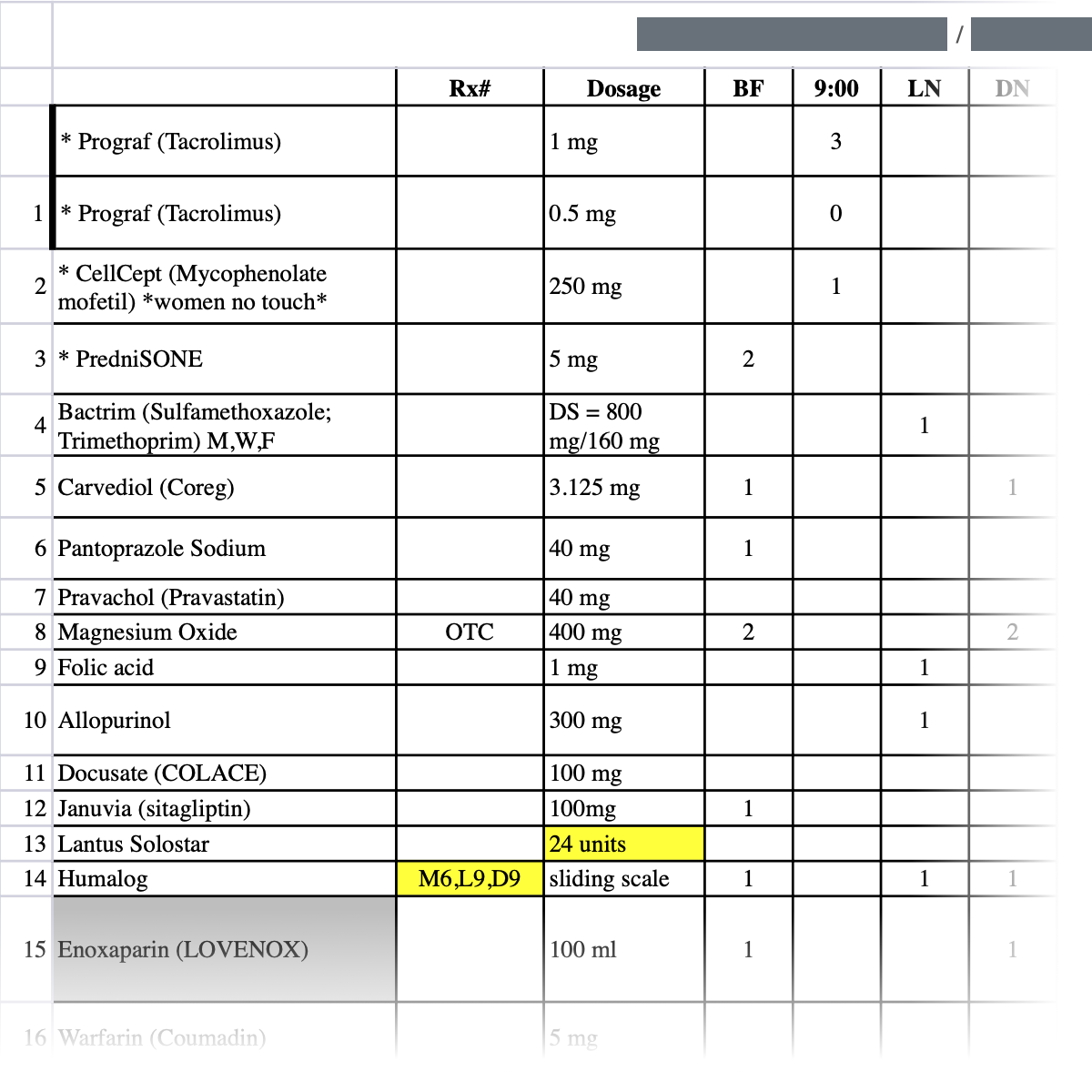
A sample of drugs from a heart transplate patient with a pre-existing chronic condition. At its extreme, a person could have a whole spreadsheet of drugs they need to make sure they continue to take once aged in to Medicare.
We couldn’t do anything about the visual identifiers due to API limitations, so focused our attention on simplifying drug data entry on our website.
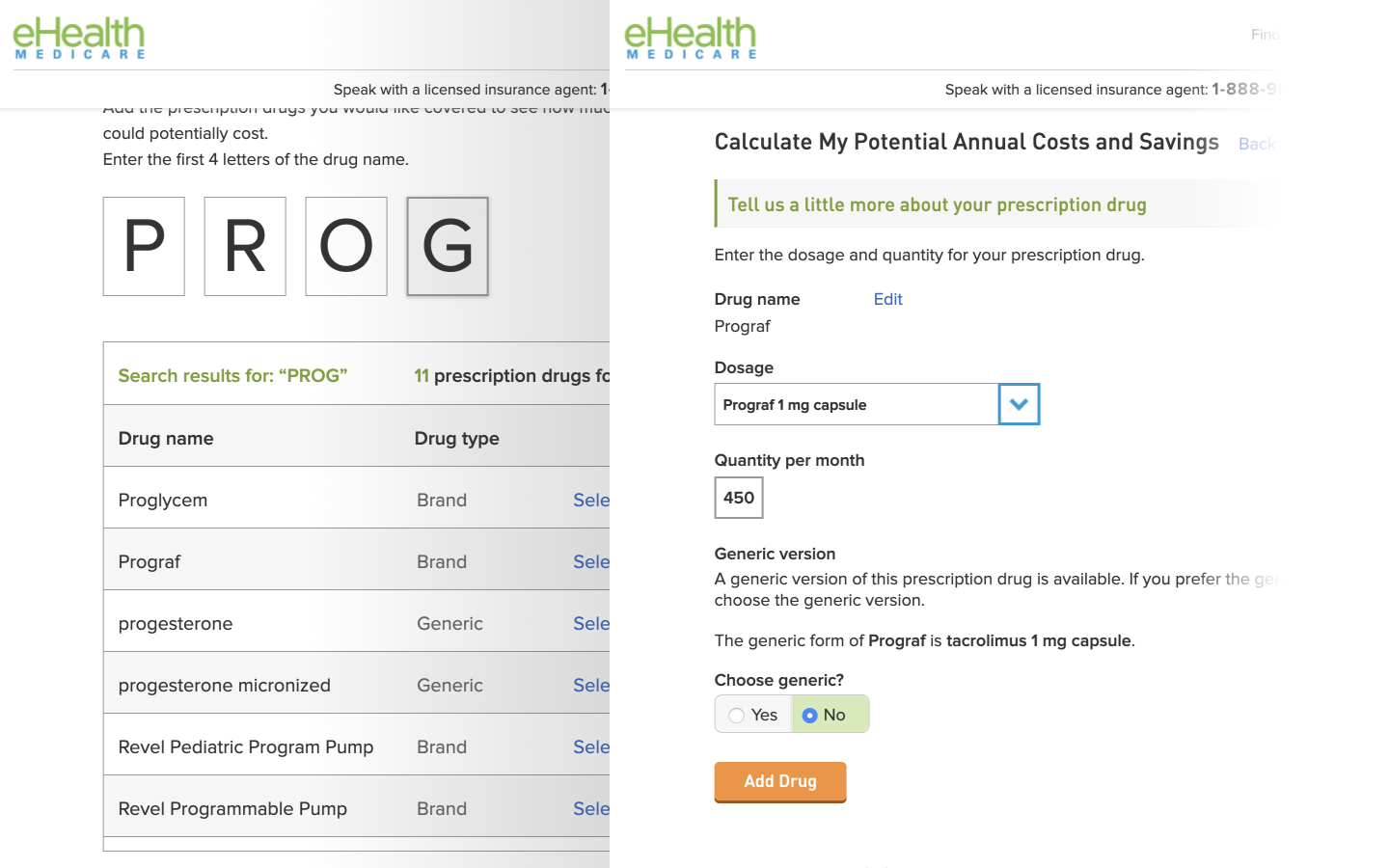
The old Drug Tool (pre-2020) took the user out of the shop experience and into a separate page.
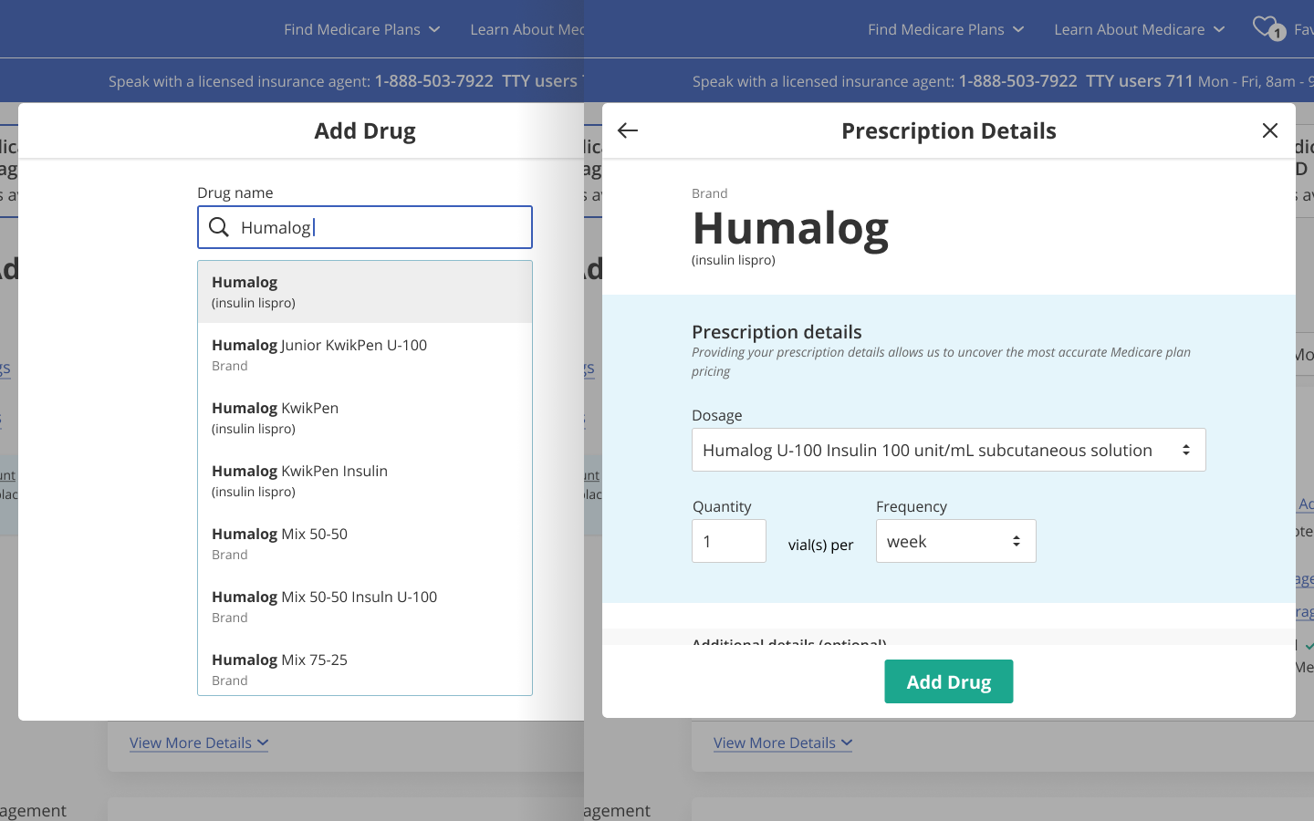
The new Drug Tool (2020) floats within a modal to allow the same component to be opened from various pages and keep the user within their current experience.
The original drug tool was difficult to navigate and required the user know their dosages, package distributions, generic vs brand, and the exact spelling in order to include it for drug pricing. The new drug tool simplified customer data entry to JUST the drug name. The user could search for their drug like a normal browser search. We even handled fuzzy searching by surfacing the most likely match as the user typed. The rest of the details became optional. We defaulted the dosage and quantity to the most common and made packaging details unnecessary (we could average out the costs without it without hurting customer trust).
These design changes altered the tool from a “give us the necessary information” mindset to a simpler “just tell us what you know.”
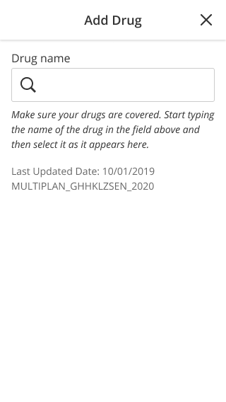
Drug Tool (Mobile) - on first launch of Drug Tool, user sees the search screen to start. (click to see full height versions of these mocks)

Because of how drugs are cataloged in databases, we cannot combine all “Humalog” into 1 listing, so we surface the most likely match to the top (“most likely” is based on most commonly prescribed and fuzzy keyword search that reacts to each character typed)
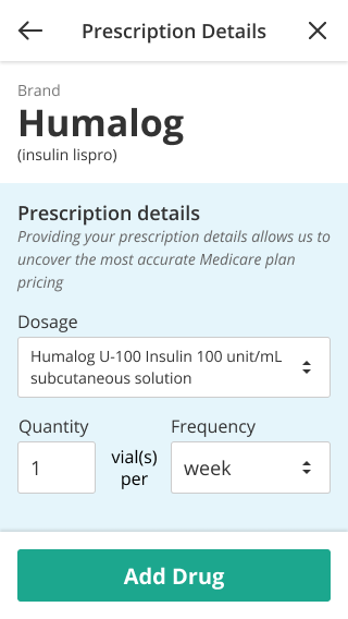
Prescription details are pre-filled with most-common dosage and frequency. Below the fold the user can also indicate package size, though we do not surface it strongly since it is not necessary to the flow. The most common use case user can just verify the visible information and click “add drug”
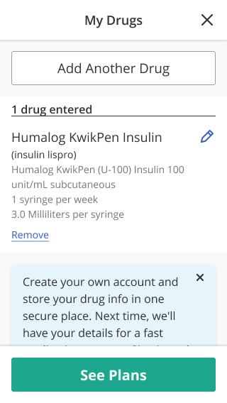
Once a drug is added, the user is taken to a summary screen where they can see their drug list. On desktop, the user can also print this list for their own uses
Once a user adds their personal information and exits the Drug Tool, they are able to filter and select plans based on coverage and pricing of their prescriptions.
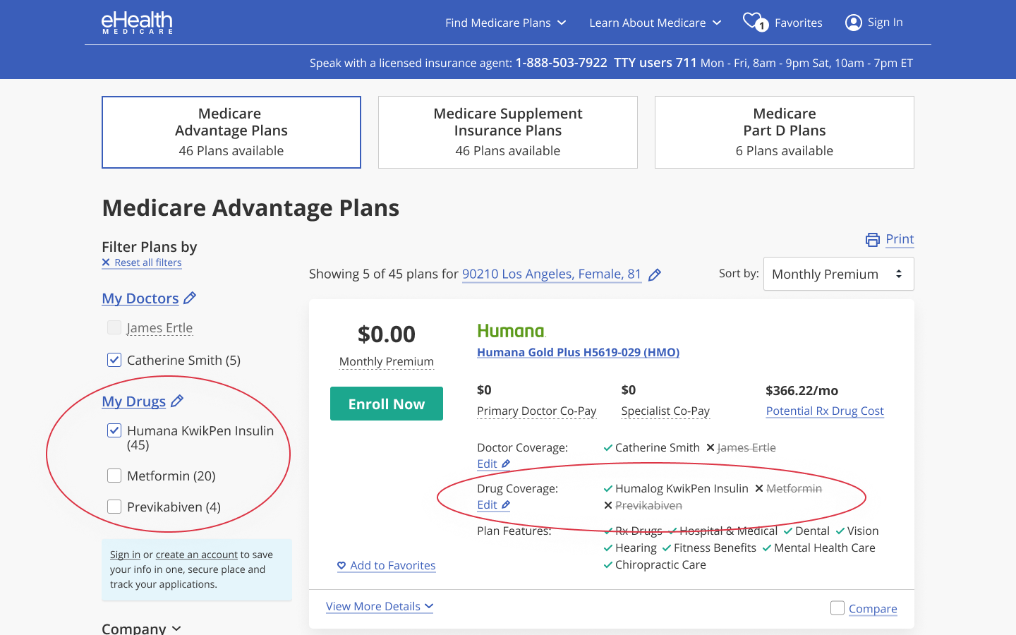
Once the user exits out of the Drug Tool, they are able to see their drug coverage and drug pricing details for each available plan that offers drug coverage.
Tools UI Framework
Drug Tool (and Doctor and Pharmacy Tools) was conceptualized with the potential to do more for the user than narrow down Medicare Plan options. My passion to reduce friction in personal healthcare is what led to the ideation of these "manage your information" tools. Therefore, it was important that its design be flexible so it could exist in multiple experiences.
A modal framework was ideal to allow the tools to be opened from various locations while still keeping the user on the current page.
The design of the tool itself was kept minimal in order to not create visual clutter in this modal state. Rather we relied on typography, spacing, and blocks of color to create a visual flow. Certain navigational elements (such as a sticky header with a close X and optional back arrow (depending on whether the user entered this screen from another modal or from a host page) were kept consistent across all tools to create a reliable and recognizeable UI pattern for the user.
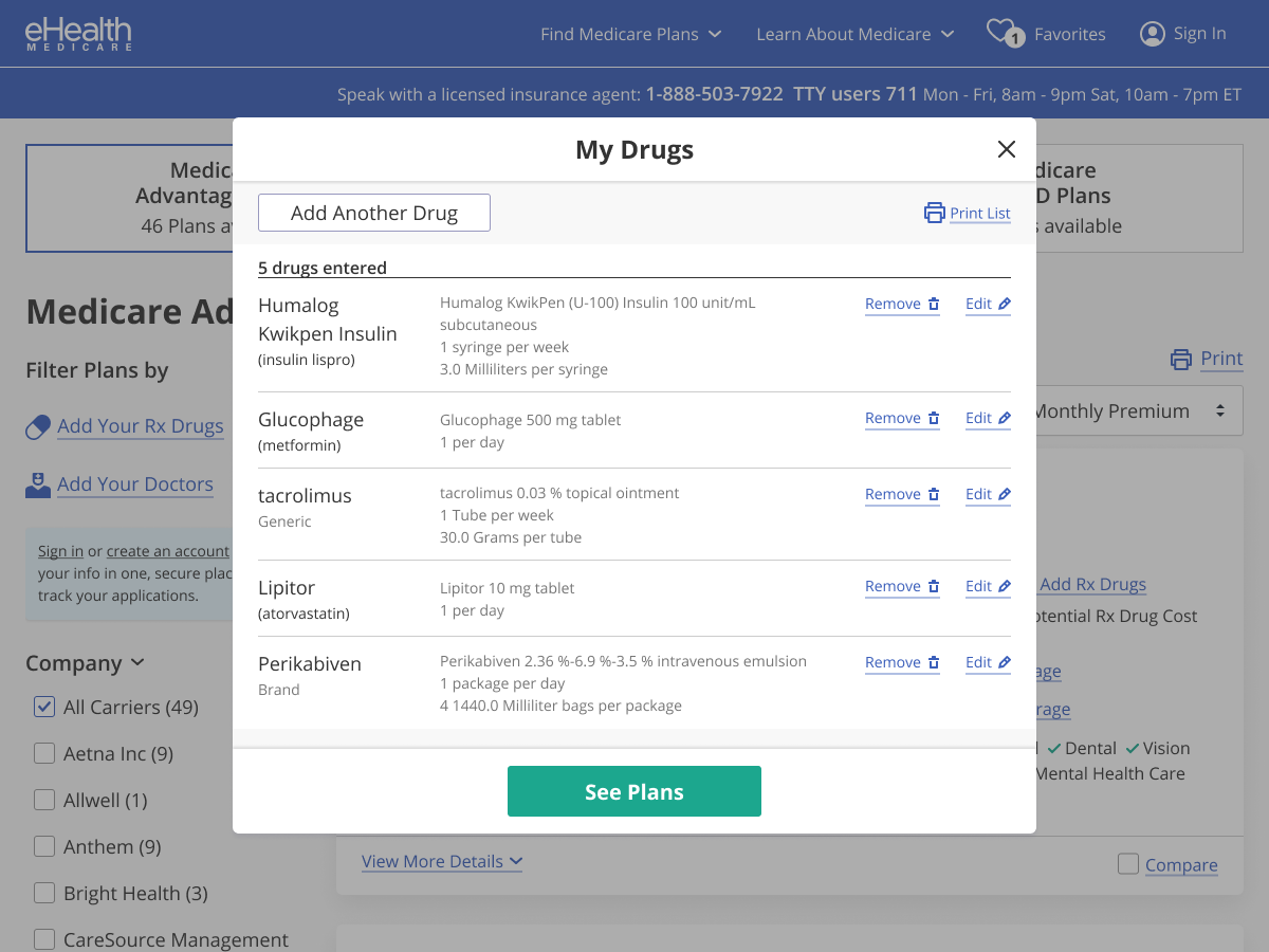
We used a modal framework for the Drug Tool in order to make it visually flexible so it could exist in multiple pages. Its core experience was for the shop flow though.
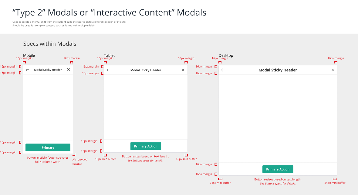
Full design specs of the modal, including screen height variances (click to see full mock). This was used to keep the layout consistent across the designers and the different development teams using this component.
Doctor and Pharmacy Tools
I managed the design of Doctor and Pharmacy Tools, which were worked on by Anna Mazzanti.
Doctor & Pharmacy tool had extra challenge with the technical constraints of legacy API and scope limitations. As her manager, I made sure the design team’s projects kept a visual consistency across the eHealth Medicare experience. With the Tools, I made sure the designs followed the same UI framework as the Drug Tool so that they would behave consistently and feel like part of a set (more on the importance of this below).
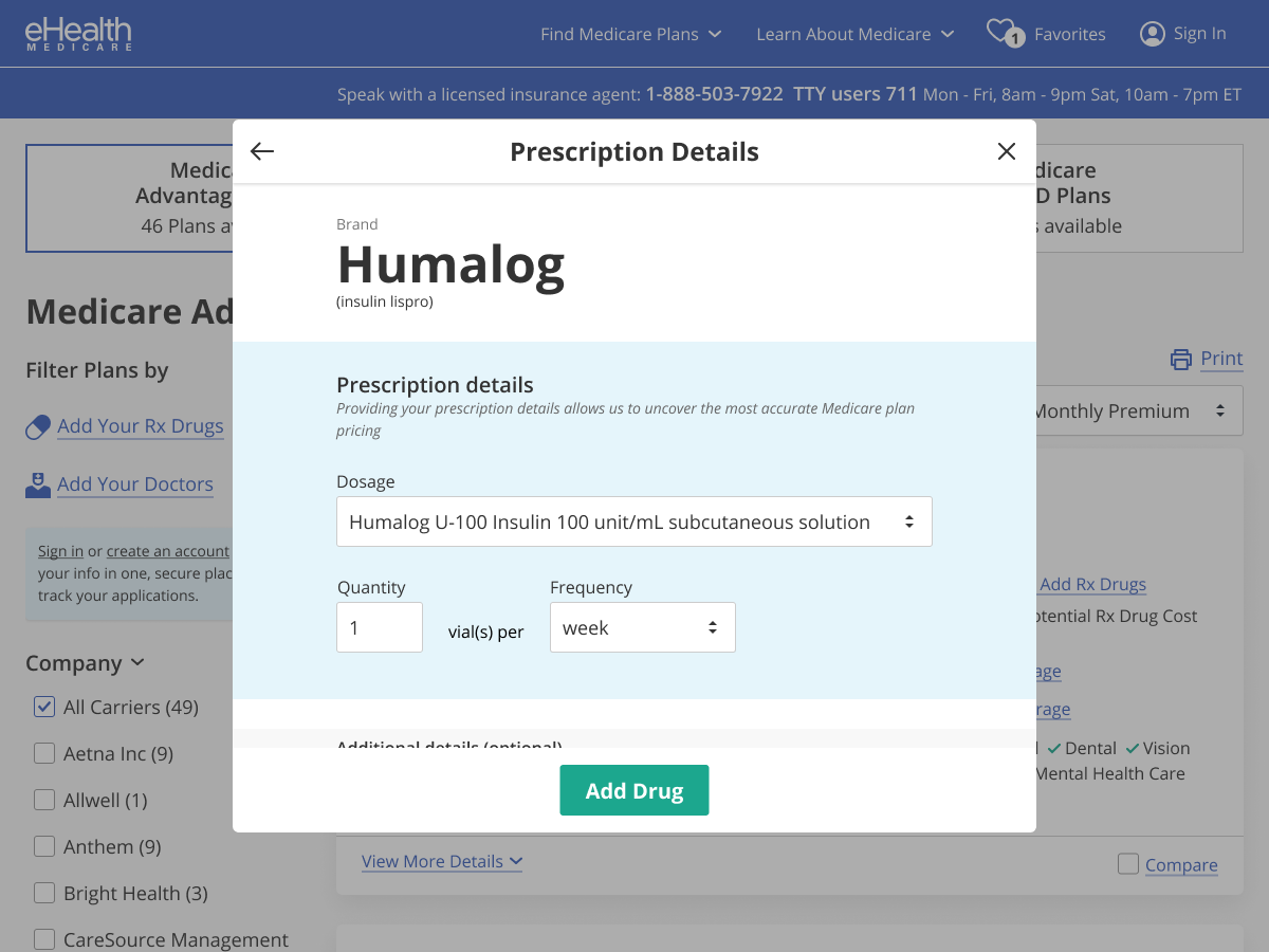
Prescription details page of the Drug Tool (designed by me)
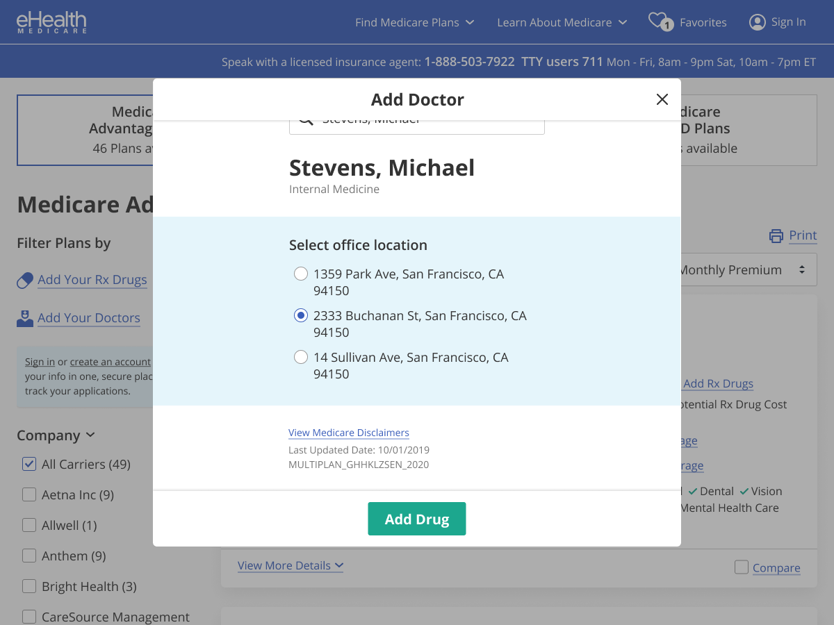
“Add doctor” screen of Doctor Tool (designed by Anna)
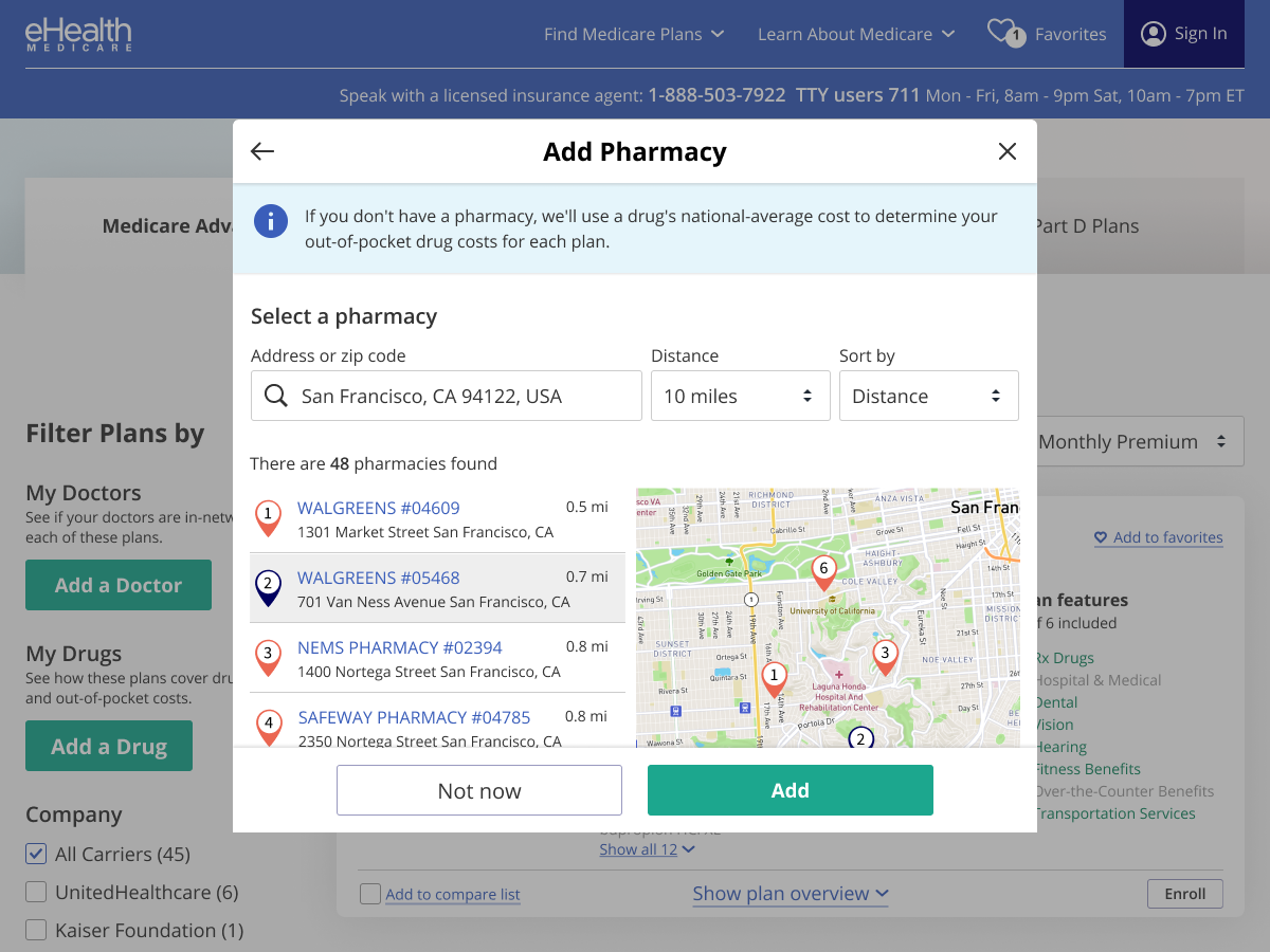
Pharmacy Tool (designed by Anna)
I’m a strong believer that the best way to learn is to try. Therefore as the manager, I would preemptively collaborate with the Product Owners and stakeholders to define the deliverables and project structure before initiating a “kick-off” with the primary designer. With Doctor and Pharmacy tools, this allowed Anna to run with the real work and gain experience working on real challenges without significant risk to the project or company goals (now that she is more comfortable with expectations and the complexities of these projects, I've started bringing her into projects earlier so she can witness or take ownership of the different aspects of the product designer role).
Alongside Drug Tool, Doctor and Pharmacy also are used throughout the eHealth experience and have been integral in improving conversion. Customers who used Doctor Tool were 3x more likely to enroll in a plan.
Personal Code
Personal Code was the first project to expand upon the Tools feature by integrating it with Partner companies. A customer would interface with the partner company (i.e. a Walgreens customer would go and pick up a prescription. Or a Sutter Health customer would receive an email) and receive a personal 6-digit code with instructions and a URL. Entering that code (or simply clicking the personalized URL if coming from an email link) would import their personal data and pre-fill all the respective tools for them.
This did 2 things:
- Allowed the user to skip over the manual entry portion of the Tools features and jump straight to shopping for a Medicare Plan
- Built trust in the eHealth brand since it is partnering with a brand they already trust and are actively familiar with
Personal Code got its own dashboard that also followed the Tools UI Framework with added styling to match its dedicated landing page.

1. A user is prompted from a 3rd party to go to eHealth Medicare to find Medicare Plans and is provided a personal code. In most cases, we can also pre-fill the code in the form for them. They just need to provide the personal identifying information.
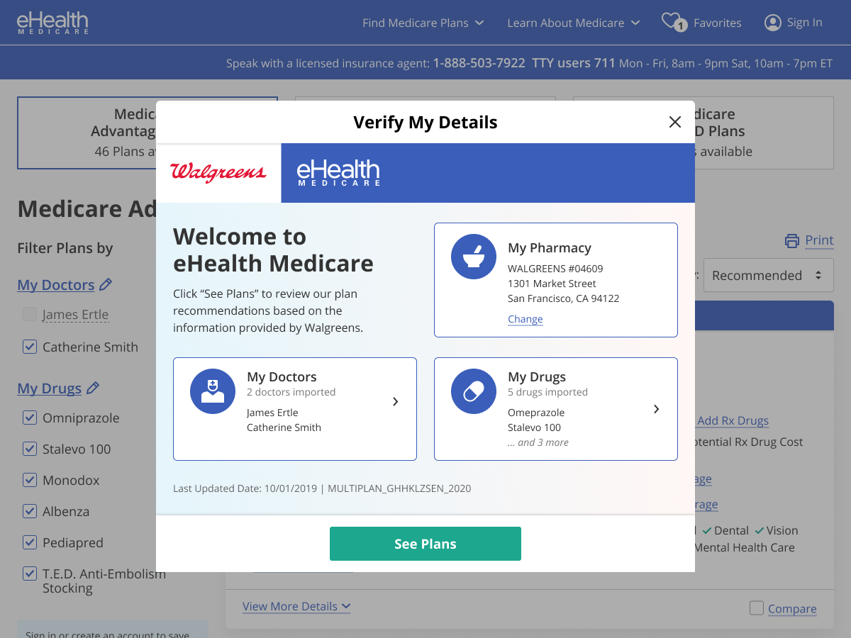
2. After submitting their Personal Code on the landing page, the user is taken to the shopping experience, with this modal open by default so they can review the data that was imported.
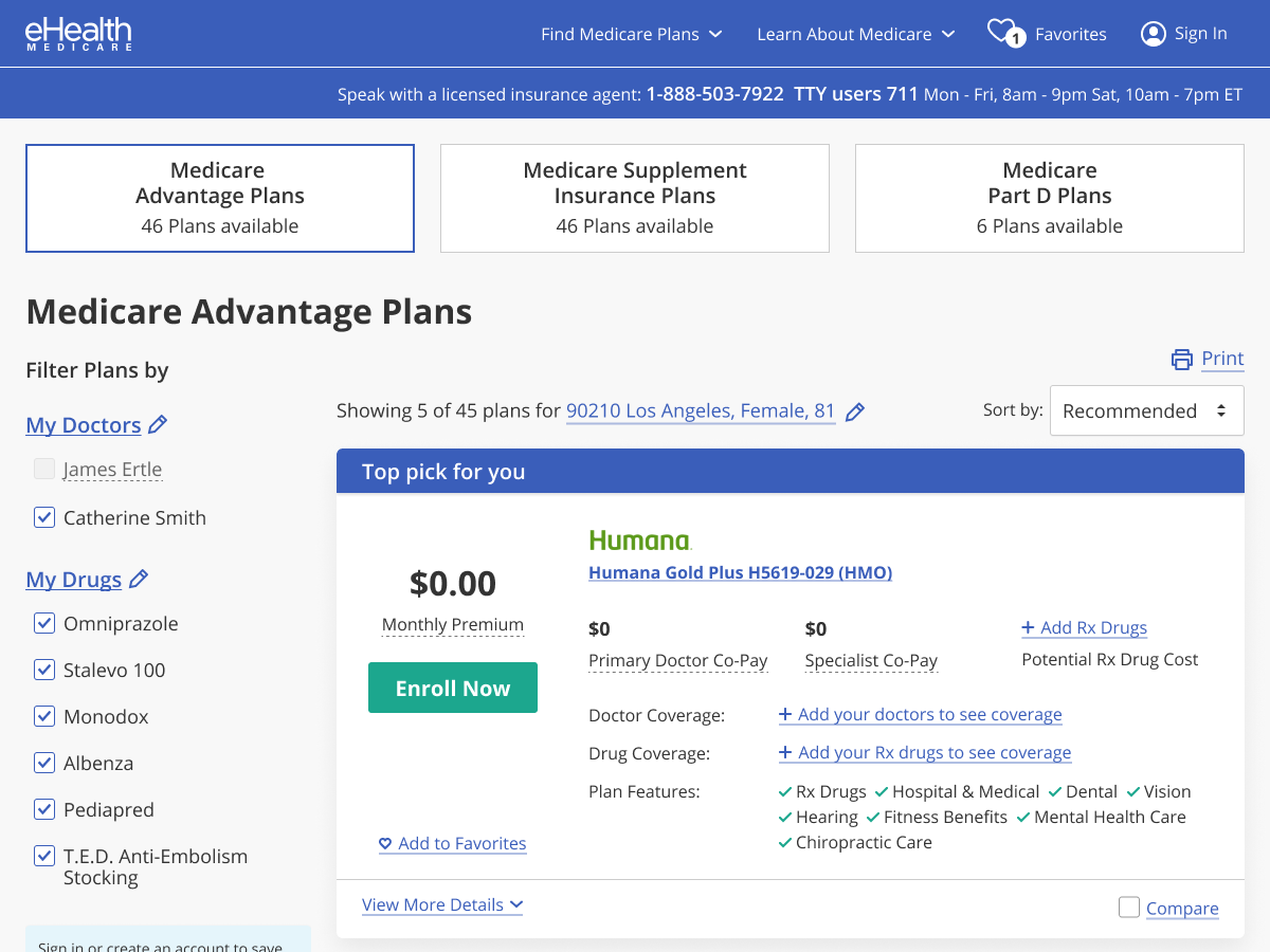
3. Clicking “See Plans” will close the modal. The user now sees a shopping screen with their doctors, drugs, and any additional data already pre-filled. We’re able to surface a recommended plan due to this information.
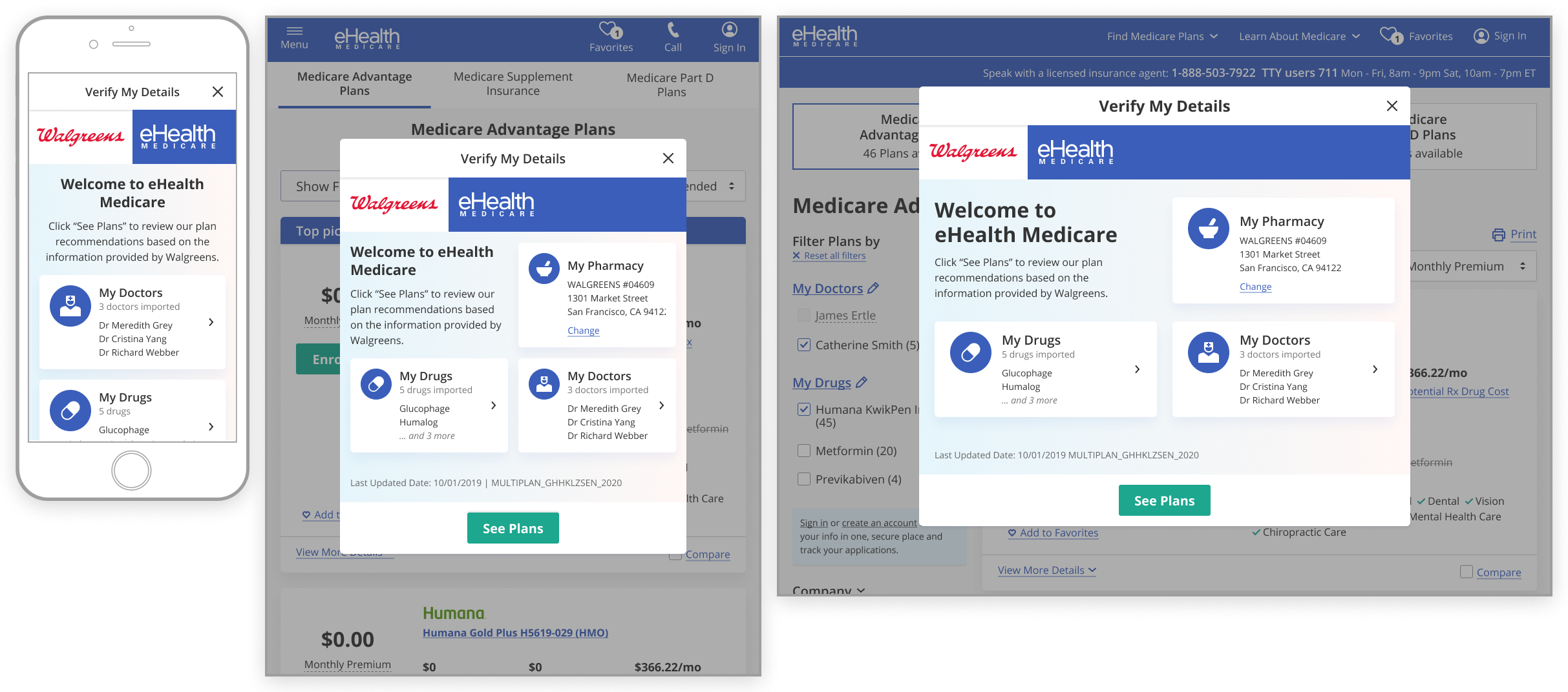
Personal Code mocks at mobile, tablet (portrait), and 1200px-desktop widths.
Tools Widgets
This year (2021) we launched our Tools widgets, which allows tools functionality to exist in external partners’ websites as a transition flow between their site to ours. The user enters their drugs, doctors, or pharmacy on a partner’s website and once done, are taken to our site to shop available Medicare Plans that match their criteria.

Our first Tools Widget customer (1-800-Medigap).

Pharmacy widget’s user flow. Chris designed the initial linear flow while I updated his designs with edge case support and stakeholder requests.
These designs were started by Chris Lorensson and finished up by me. They utilize the flexibility and simplicity of the Tools UI framework, allowing certain components to be stylized to the partners’ branding while maintaining an eHealth presence.
Final Thoughts
As eHealth continues to grow and expand their online capabilities, these tools become a foundation to the customer's self-guided experience with us. My original intention was to move eHealth away from a single-transaction mindset to considering themselves as a reliable web portal for the Medicare customer.
Each year brings eHealth closer to this vision and my hope and intent is to encourage that focus as new projects are defined and scoped each year.