Magazine E-Reader Designed for Mobile Devices
Texture | 2018
Mobile, Tablet, Chromebook, & Kindle app
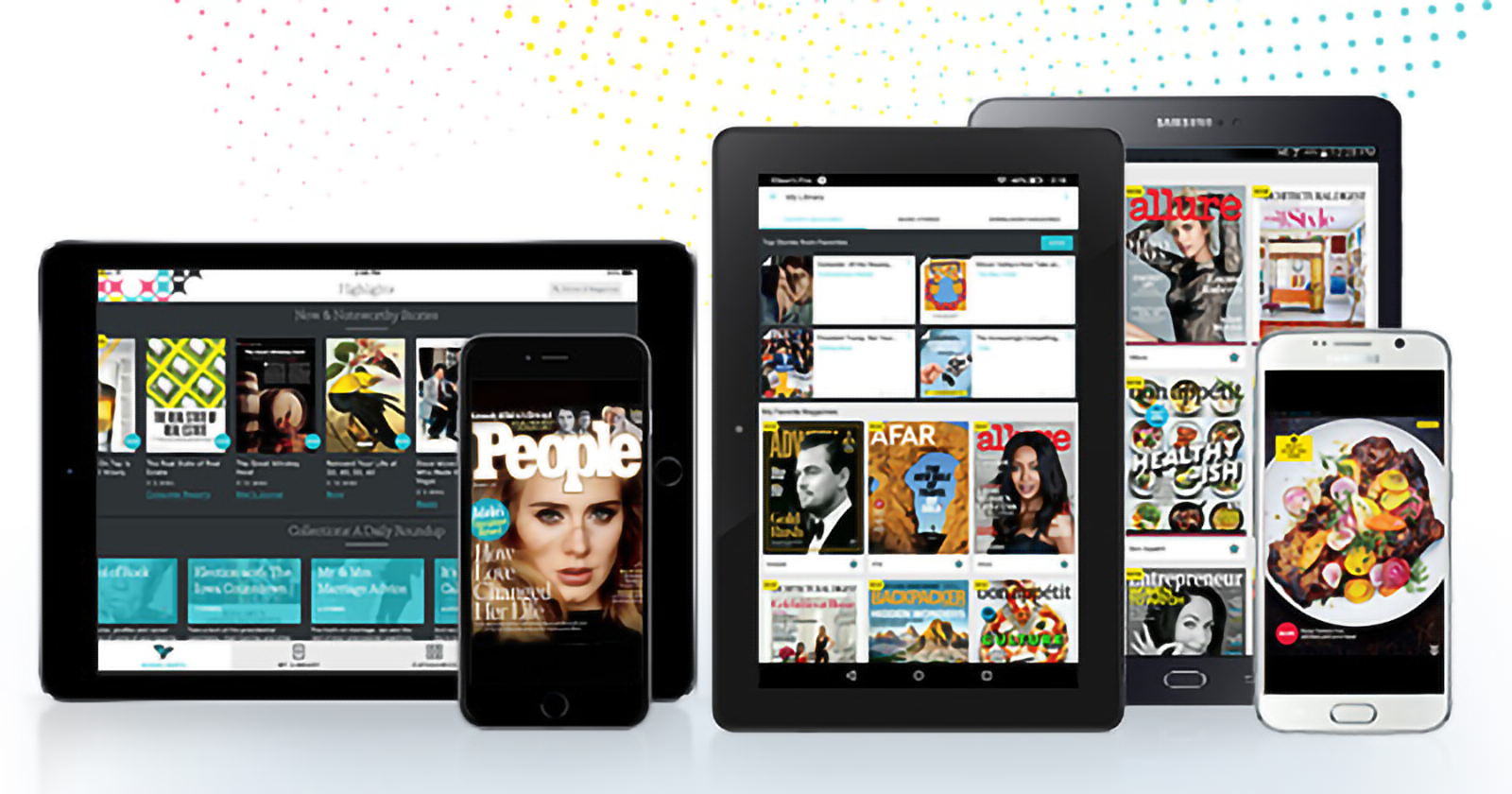
Background
As the lead designer for the Android version of Texture, my primary goal was to make the app feel native to the Android ecosystem while maintaining Texture’s brand presence. Supporting Android also meant making sure the Android users’ expectations on an app’s abilities were met, such as supporting SD card storage and allowing Amazon registration (especially useful for Kindle users).
During my time working on Texture, the app went from a 3-star rating to a 4-star rating on the Google Play Store and received a 4.5-star rating on the Amazon App Store. It has been downloaded over 5,000,000+ times on Android devices.
About Texture
Texture is a magazine-reading app where you can follow and read issues from over 200 magazine brands. The app provides online and offline reading, autodownload options, magazine and article search, notifications for new issues, and a separate feed of curated articles for the latest topics across all brands.
Key Highlights
- Migrated designs from an iOS style to Android to make Texture feel native to Android devices while keeping a Texture brand presence
- Designed features unique to the Android version, such as SD card support
- Created a responsive layout to accommodate the vast array of Android supported devices (including mobile phone, Android tablets, Kindles, and chromebook)
- Collaborated with developers to incorporate Android theming tools for reading accessibility and easier development and maintenance
Details
Migrating designs from iOS to Android
I joined Texture shortly after its first release of its Android version. Therefore the initial design work done was fast and iterative, using rough wireframes and pre-existing styling to get features out the door to catch up with iOS.
As Android OS went through updates and provided smoother support for custom theming, we took advantage of these changes to meld our brand’s look with the expected look and feel of native Google apps using Material Design (circa 2015-2016).
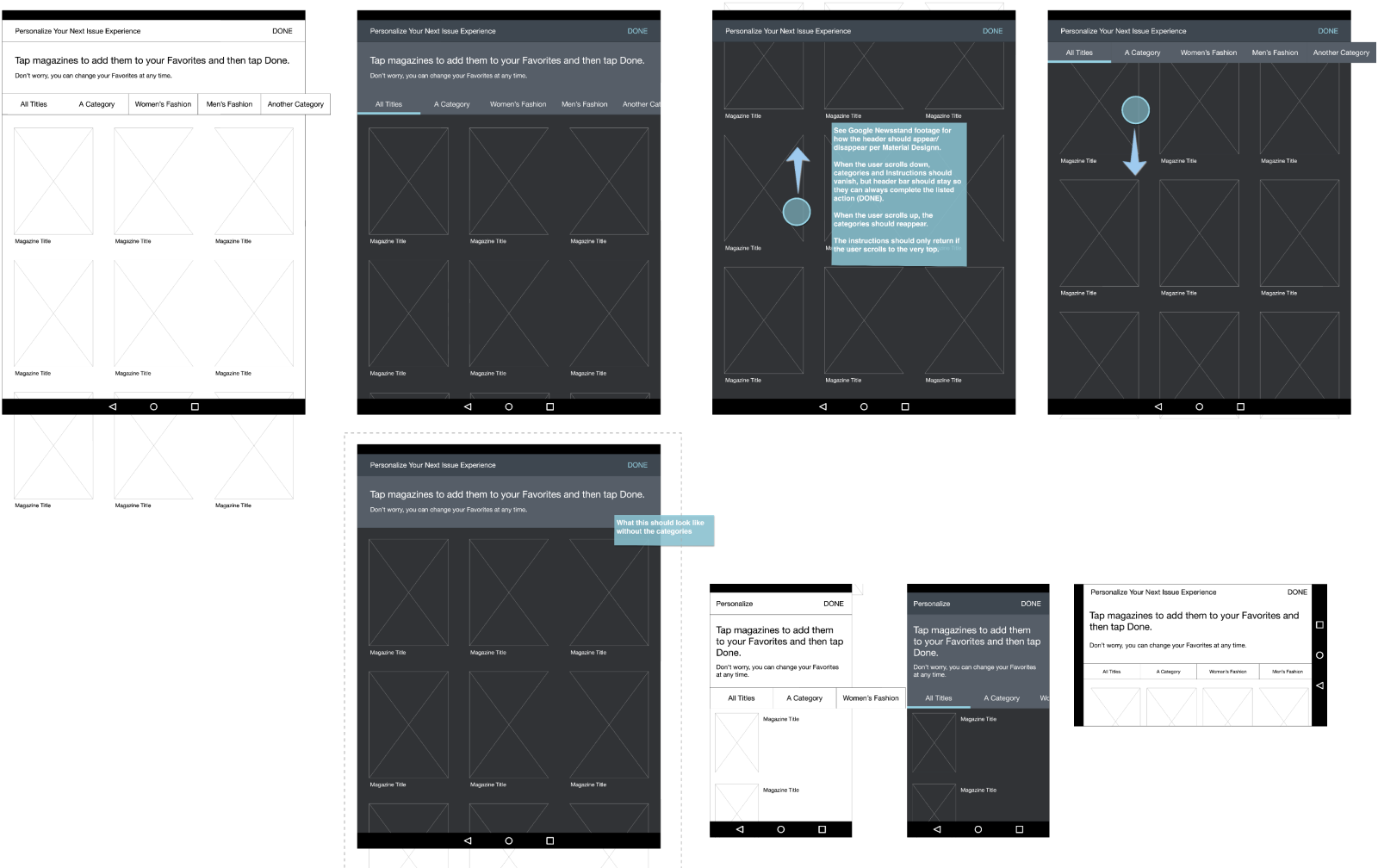
Example wireframes delivered in early stages of my career at Texture. Engineering needed rapid delivery, so we agreed on this low fidelity mock with open channels of communication for any questions. This worked well with the on-site team in Menlo Park, CA.
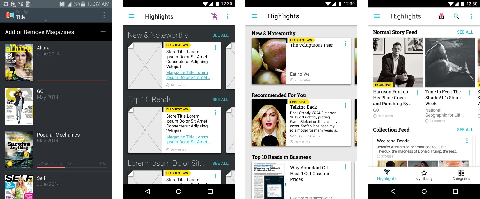
Changes on the smartphone portrait layout from 2015 to 2018. We took advantage of Material's "paper" concept and turned our story cells into cards over time, eventually flattening into an ink-like experience as Material evolved.
Outside of visual and layout changes, Texture's IA and UI went through iterations as well, responding to user tests and internal feedback as well as personal observation of interactions by others.
Navigation, for instance, started with a left-side drawer-based design and later moved to a bottom bar. We, the UX team, initially wanted to use a bottom-bar format from the beginning, but held back on the Android version due to the conflict with the Android device’s default navigation (the back, home, and expand button on Nexus and Kindle devices). However over time, and as users became more familiar with this interface due to other more popular apps (YouTube, for example) we were able to confidently update ours as well. This helped reduce the number of steps required to jump between the different sections of our app.
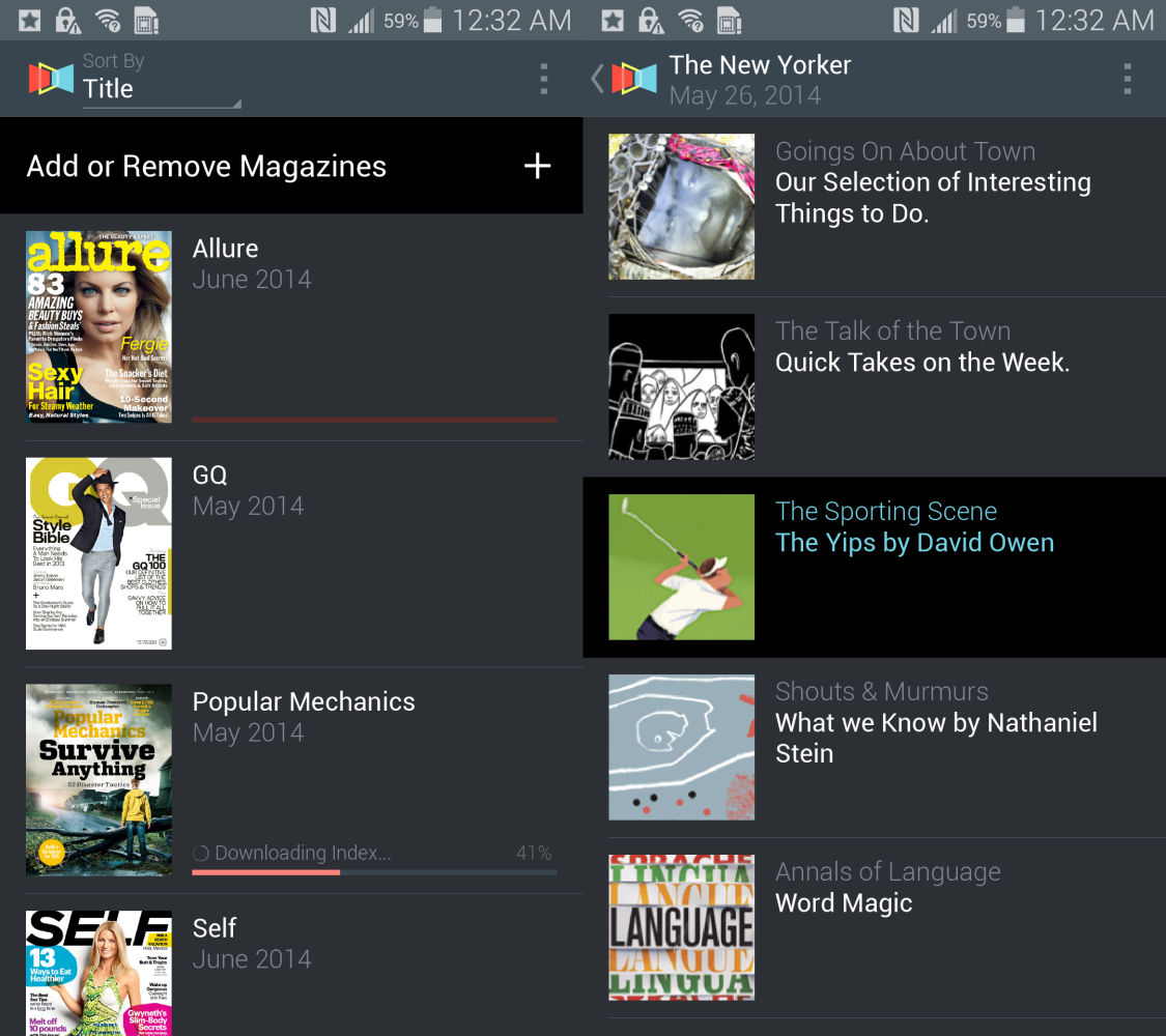
Original UI (mobile version). Issues opened directly to a list & thumbnail view of the Table of Contents.
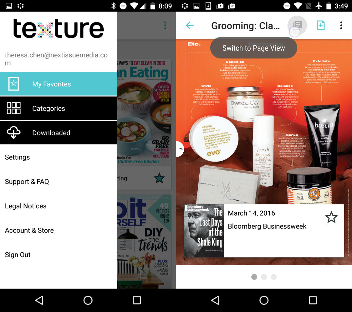
Redesigned to utilize a navigation drawer, issues opened directly to the content with a back arrow that would take the user to the Table of Contents before exiting to the main menu. This proved to be confusing UI and was later changed to have the ToC in the overflow.

Final version uses a bottom navbar for main navigation and an overlaid card menu for the Table of Contents within the reader. After many iterations, ToC and page-/reader-view toggle were combined into one menu, so they shared the same icon in the navbar.
Texture's core experience allows you to read full magazine issues as well as curated articles that had been formatted for easier readability on mobile devices. Majority of conceptual design work focused in this section of the app, as the UX team collaboratively worked to provide ideal user experiences for reading on each device.
Particularly with the e-reader, concepts were prototyped, tested with invited users, and then adjusted per collected feedback. Much of the designs remained unimplemented due to scoping changes, but the knowledge gained through testing was used to improve the e-reader that was currently live in app.
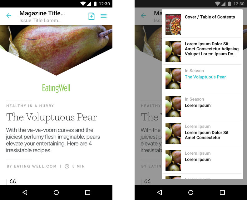
On mobile, some issues and articles could be read in an optimized format, supporting vertical scrolling to read through text. Availability of this feature was highly dependent on the content providers. The overlaying UI was consistent with the page-view format.

Some conceptual designs for a new in-reader navigation system were ultimately left unimplemented due to a shift in company direction. However, some elements (like the page carousel) were adapted into the current e-reader instead
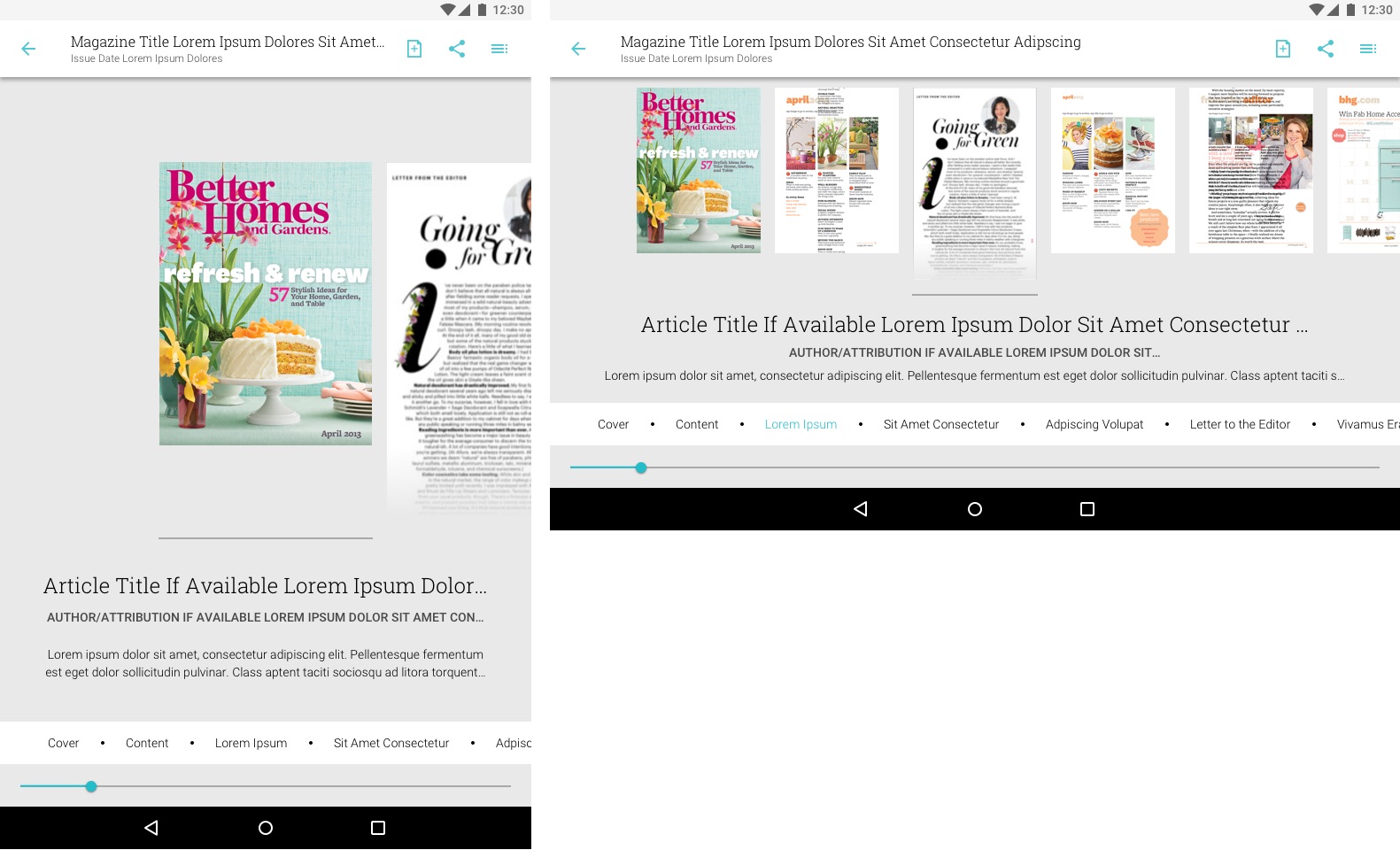
In-reader page carousel navigation implemented for tablet only. This design was adapted from the initial concept as an easy-to-implement way for users to browse through an issue. Pages would snap to the center bar, updating the title and description below if available
Android-Unique Features
SD Card Support
Unlike iOS, many Android devices support SD card storage. Due to the size of our full page high res magazines, it was important we allow our users to store the app (or just its magazine issues) within SD cards. This was a challenging feature to implement as the possibilities of user input were vast, causing more complications underneath the hood than the visible 1-tap toggle would imply.
The solution was a very in-depth brainstorm with QA, listing out the possible scenarios, writing down what the ideal result (from a user's perspective) would be at the end of each scenario, and scoping those scenarios with the project manager and the developers. Through scoping, we prioritized the scenarios and committed to iteration the ones most likely to satisfy the users' needs.
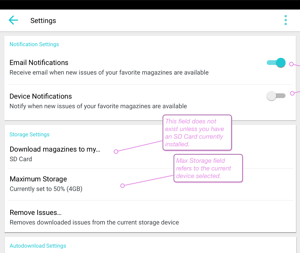
Android has several unique features, such as SD card support, that is not consistent across all android-supporting devices. For devices that have SD card slots, we offer separate SD card storage for magazine files.
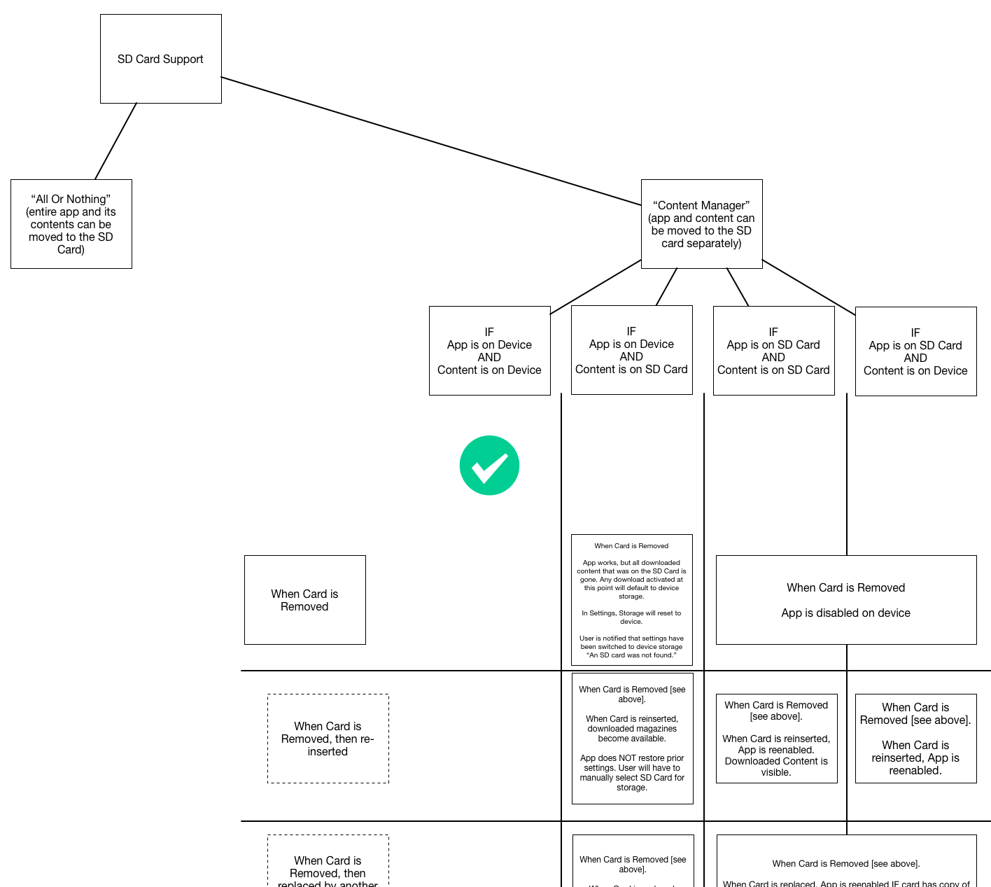
SD card support required understanding common usage of SD cards in android devices. On a technical side, while the user is able to use multiple SD cards and swap them out for various storage reasons, the most common user scenario is that they will buy an inexpensive device, and enhance it with a large-capacity SD card and leave it in. Our app’s issue files were the largest component and the thing needing storage the most. Therefore, we were able to omit the rightmost column of this logic chart and focus on only 3 scenarios.
"Login with Amazon" Support
Integrating a new account type into a pre-existing account system is another project that looks simple from a user’s perspective but has a lot going on under the hood. I worked closely with product owners and key stakeholders in this Kindle-specific relationship to address possible use cases when attempting to use the “Login with Amazon” feature.
Mockups and prototypes were done in high fidelity for easier communication with stakeholders and product managers so that desired concepts did not get sidetracked by visual mishaps or confusions.

“Golden path” user flow for Login with Amazon. We expected this to be the most likely scenario of users coming in and attempting to Login with Amazon. Open the expanded image to see the variety of use cases this simple login flow had.
In addition to the above, we also made sure to implement changes to make interaction feel more native, such as press-and-hold tooltips, snackbars, and transitional animations between navigation and reader.
Responsive Grids and Accessible Layouts
Because Android OS can be used on a wide array of devices, there were also a wide array of screen sizes to support. Defining a detailed responsive grid was important for the developers, but it also provided visuals to better communicte with other stakeholders. Editorial, for example, would be influenced by potential text cut-off points and needed the visualization to communicate that.

Example of a high fidelity and marked up mockup sent to developers and stakeholders. For developers, the specs helped create the rules added to the code. For the stakeholders, especially editorial, the mockup variations helped visualize how their copy might be altered based on cell width
Determining specifications (such as font size and touch targets) required testing these mockups on specific devices in order to make sure size, spacing, and layout were appropriate for each device. It was a lot of math, trial, error, and collaboration with the QA team for their wide range of devices to test on.

Specifying a grid system involved math and trial & error, testing on multiple devices to ensure sizing and readability before defining the rulesets our responsive grid should follow.


Example of a set of grid/main screen layouts based on screen width and height. These were exported individually and loaded on to respective devices to test.
Particularly with mobile landscape (and subsequently, situations where the app was viewed in a split screen view), exceptions needed to be made to layout based on screen height. While the overall grid did adjust slightly based on these details, this was most notable in the logged out view where the call to action would have otherwise been cut off without adjustments.
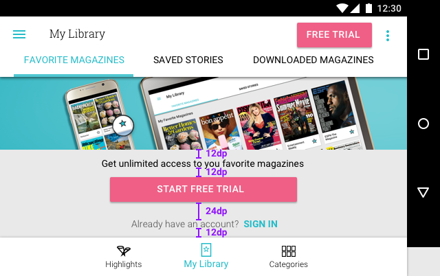
The graphic banner was part of Texture's "theming aesthetic" but including it in mobile landscape pushed important interactive content below the fold.
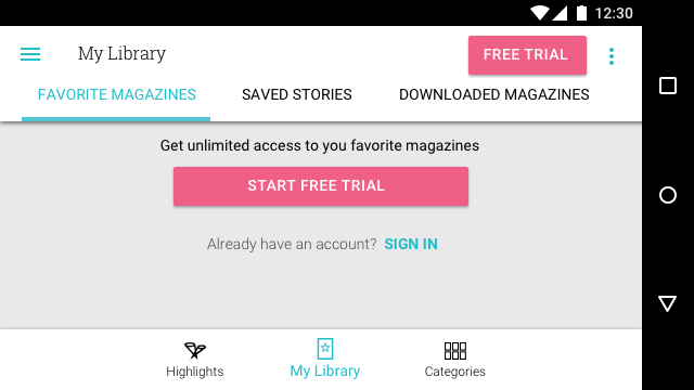
Because the graphic banner would push the "Sign In" link below the fold, we opted to remove the graphical element in favor of functionality for mobile landscape, creating a use case based on screen height. This also occurs on split screen view.
Additionally with large HD tablets and Chromebook, due to the higher resolution and screensize, minor tweaks to font size, spacing, and cell sizing needed to be made to make it a user experience that felt native to the device, rather than something simply magnified to a larger screen.

Example of font, spacing, and sizing adjustments made in this higher-resolution layout. While side-by-side here, it's harder to see why one would be preferable. When seen on a device, the sizing choices make a lot more sense
By working with the android development team for best usage of Android SDK’s theming, we also made sure the text and visuals could easily resize based on device settings. For example, if the user specified a large font size across their device, our article cells would adhere to that and display the text enlarged as well.
Initial design work was done by creating high fidelity mockups and exporting them for view on android devices. However, implementing responsive grid and accessibility options required more direct interaction with developers than simply delivering exported mockups. It was a highly collaborative process of downloading builds, testing on different devices, and coming back with adjustments as needed after the initial design work. We dedicated dev time during sprints to polish these details and make sure the experience was optimal for that 4+ star rating on the app stores.