Accessibility at eHealth
eHealth Medicare | 2020
Responsive website

Background
In late 2019, eHealth scoped an initiative to make all their products compliant with WCAG 2.1 accessibility guidelines. After completing accessibility training with Deque, I became the primary design resource for facilitating and supporting the many product teams within eHealth for their 2020 accessibility compliance goals.
About eHealth
eHealth is an online health insurance marketplace where customers can find plans from 180+ top insurers nationally. With over 5M+ customers served, eHealth is a leader in providing a customer-centered experience in the complex system that is healthcare.
Key Highlights
- Consulted with eHealth’s various product teams on accessibility fixes and provided design solutions for accessibility issues that automated tools might not be able to discern
- Coordinated the design team’s work on eHealth Medicare to make sure everyone was aligning on accessibility best practices
- Remained an “on-call” resource for the company for any accessibility questions regarding layout, color contrast, labeling, expected flow and hierarchy of content.
Details
Color Contrasts
In 2020, eHealth went through a visual overhaul to create a “professional, trustworthy, and helpful” look & feel. The design team quickly released a new UI Kit within the 1st month and continued to build its components in tandem with new features throughout the year (it is still a living document in 2021).
We chose blue as our primary color due to the “professional” look it provided for a health-related website. Blue also provided the most flexibility due to its wide value range as a color.
In order to assist the design team as they created their mocks with this new styleguide, I created a quick-reference color contrast guide for “most common scenarios” that not only identified if something was accessible, but also identified standard use of colors to keep a consistent feel across pages.
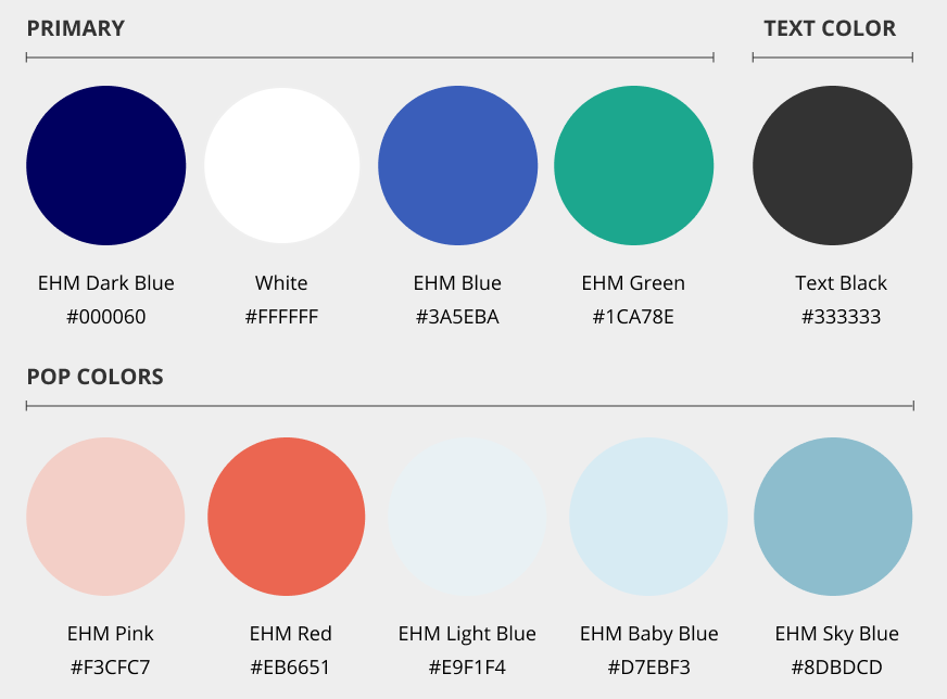
eHealth Medicare’s official brand colors (2020)

A quick-reference guide on accessible text colors sorted by background-color. Designer could determine at-a-glance which color combinations are accessible with their common elements.
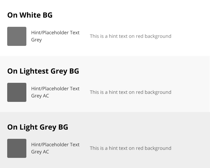
On darker backgrounds, we use a darker shade of grey for grey text in order to meet necessary contrast ratios.
Through this exercise, I also could identify areas where desired colors needed an A11y version when used on a darker background. Our text grey (#767676), for instance, had a contrast ratio of 4.54:1 on a white background, but on even our lightest grey background (#f8f8f8), the contrast failed for its intended usage. Therefore I added a darker version to our style guide for these instances only.
This was particularly helpful in help or error text situations where the background color changes based on state. The text also needed to change in order to maintain sufficient contrast ratio for readability.
Making sure this was consistently implemented within the various product development teams was a challenge since some nuances of accessibility are not as easily obtained through out-of-the-box solutions. Disabled text, for instance, is purposely too light for accessibility, but in some cases, disabled text can still have interactivity or valuable information for the user. In these cases, we used that darker Text Grey in order to be accessible.
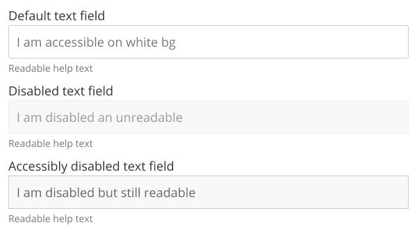
Example text field component with default state, disabled state, and a A11y-readable disabled state.
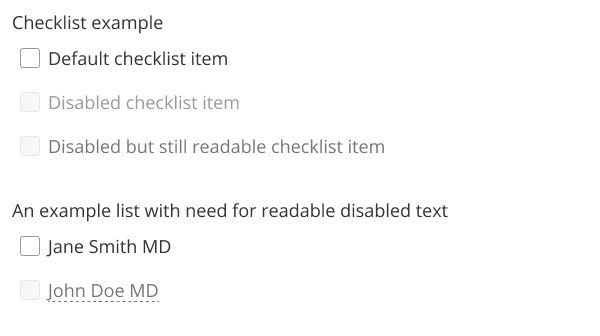
Example checklist with interactive text. Because “John Doe” has information that a non-A11y user can see, it must be high enough contrast to meet WCAG 2.0 guidelines.
Reading Hierarchy & Header Tags
H1-H6 tags are important for site navigation, especially those using screen readers or keyboard-based navigation. However, when talking about design or coded stylesheets, font sizes on a page don’t always adhere to this header tag hierarchy, making tying universal <h1> or <h2> tags to a specific style unhelpful for visual design.
At eHealth, we label our header fonts as Primary, Secondary Tertiary, etc” to differentiate it from its syntax H1, H2, H3, etc. This allows 1 page’s H1 font to be 56px while a sub-page’s H1 to be 48px.
Font sizes were also changed to rem sizing instead of px because of scalability. We calculate our font sizes based on 1 rem = 16px.
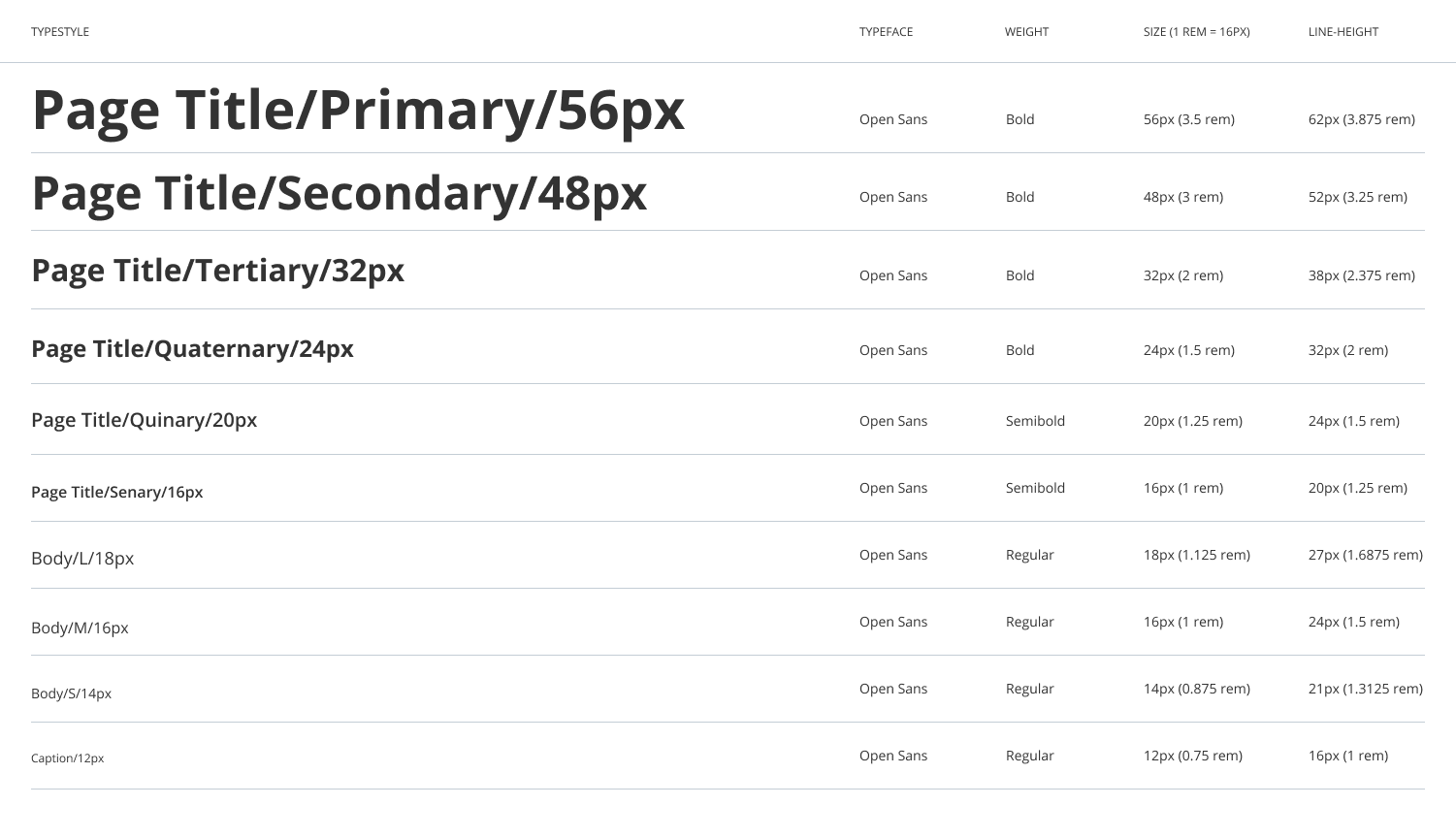
Sample Typography reference from the eHealth UI Kit (2020)
In this way, font size, styling, letting, etc is consistent across projects using the EHM UI kit while not breaking the header hierarchy of a webpage. This way, when walking through a website’s hierarchy with developers, we could identify H1-H6 tags while keeping font sizing as desired by the content creators.
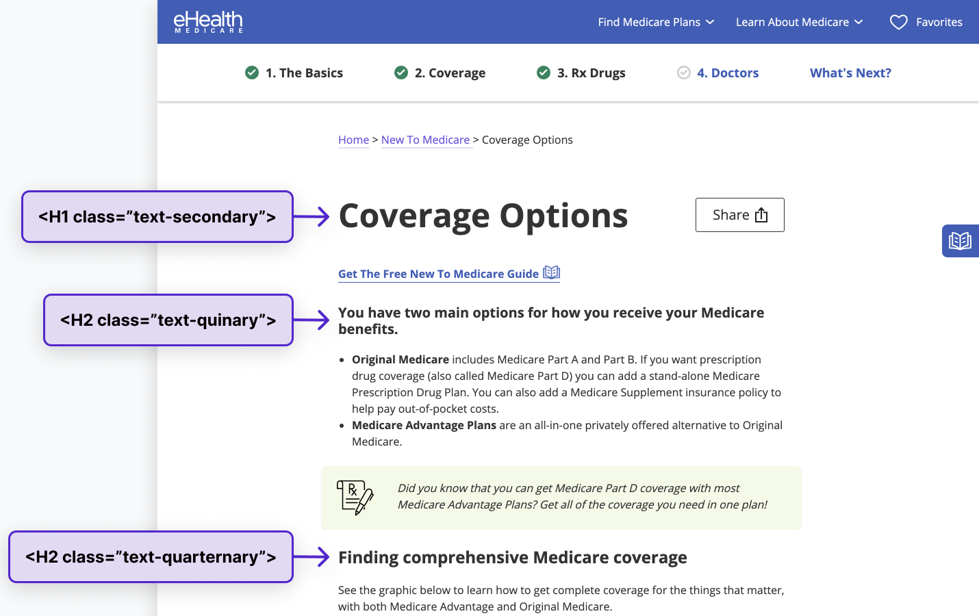
Example of typography sizing in use. Information hierarchy of the article is unaffected by font size changes that are chosen by the content creator.
Readable Images & Labeling
For the majority of this, I was highly reliant on developers to know whether to use alt tags or aria labels and in most cases, they could infer the correct tag to use.
B/c eHealth is a 20+ year old company, it also has a lot of legacy content to update. Some of it was easy (i.e. decorative stock images that just needed null alt=”” added) and for those, I could rely on the developers to know when to use alt tags or aria labels. Other images were complex (i.e. an infographic needs text description, as an alt tag, aria label, or aria describedby depending on circumstances) and needed coordination with content creators to make sure they were being addressed in their copywriting. Other legacy images had lengthy descriptions buried in their code that had to be stripped out with the collaboration of SEO. The logo, for example, needed to be simplified to the company name and any text written within (It is no longer standard practice to add long descriptions in order to raise the search ranking of the site). The SEO benefits had to be shifted to other parts of the site, ideally within the body (and relevant to the content that page provided).
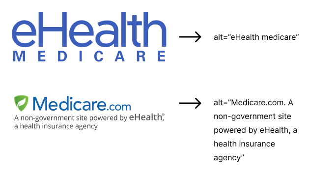
Example logos and their alt tags. Because Medicare.com has copy within its logo, it must be spelled out within the alt tag for users who use screen readers.
As accessibility guidelines and official regulations continue to evolve and improve, Keeping WCAG compliant is an ongoing process with much needed debate and discussion. The foundations made with these accessibility updates withing eHealth's products set the foundation for future work and future features within the company.